Recca wrote:
Nice update on front page Wildbill! I must say, you've certainly written great intro screens for the eight characters. Especially considering the text limitations that were involved. I tip my hat to you good sir! Even though this is still far away, I have an idea about the implementation of accented letters into the font. If we could slightly reduce the size of these letters such as ă or ş, they might fit. An 8x16 font sounds sufficient, but if not, an 8x8 font could be designed for international translations. This is just a thought.
Heh, with that limited space, it's rather like writing newspaper headlines in basic journalism class many years ago. However, maybe it's better having pithy profiles for piquing interest, now that I think about it - exactly what a news story headline is crafted to do. Anyway, I've already tweaked Ryoga's profile just a tiny bit more. Now, for the last couple of hours, I've been majorly bogged down in the poignancy of Ryoga's sparse opening strings prior to taking actual control of his character in Fire City and going after the Aqua Clean. Writing is like that sometimes, but who knows? If I make Ryoga's prologue tear-jerking enough, you may end up liking Lithia and him even better than Ryuu (but I doubt it, knowing you)! Ryoga's sister may be an angel by temperament, but you and I both appear to have jaundiced attitudes toward "sister acts".
I'll update you later tonight or tomorrow - as soon as I get Ryoga fully launched and have an opportunity to check some of the status icons in the field that are supposed to be fixed now. The one poisoned, paralyzed, (or whatever he was) character I saw with Naga's team in the Star Relic didn't look fixed, but that could have been the zst's fault. The symbol looked sort of like this: |O
Basically, for a scaled down 8X16 font with all of the diacriticals added, I believe we need someone to painstakingly go into all of the tiles and hand-build each letter slightly smaller, pixel by pixel. Taskforce is the best graphics artist I've ever known who has designed fonts for 16-bit games. His font for Taloon's Great Adventure is my all time favorite game font, commercial or otherwise. Bongo` knows how to calculate the geometry for what font sizes and designs can be loaded into specific games, both fixed and variable width. To mount a serious effort toward internationalization, we need someone with the proper expertise to step up to the plate and take charge.
I still want to set up FlashPV (who designed our BH English title page) with a matrix for a French translation of Feda.
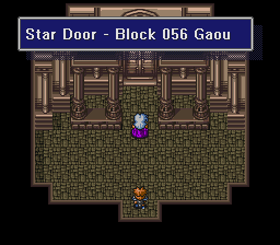
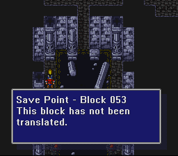
Finally, it will be so nice to have translations of these scattered blocks someday that will flesh out the final segments of the World-I story lines! The second graphic is inside the Star Relic complex - Ryuu's scenario, I believe. After all eight scenes conclude inside the room with the Star Door in the background, the World-I scenarios conclude and each character and his or her party board a ship for transport to World-II.